Illustration Friday - Spotted
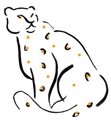
This week's Illustration Friday is spotted. A logo I created pro bono some time ago. My mom and I were just having a discussion about whether pro bono was designated for legal term only, or for any other public work for free, I think I can use it in this context. (Added a color for interest).


Kim this is so well done and simply elegant!!! Love this, perfect for the theme!!!
ReplyDeletenice clean look strong line work and simple design
ReplyDeletelooks great
ohh this is something! and thanks for that li'l trivia about the phrase. 8)
ReplyDeleteVery good indeed - less IS more! Nice to see what a few lines and 2 colours can be.
ReplyDeleteSophisticated and clean. Love the simple lines, it's great.
ReplyDeleteA great logo design and the colour spots you added make it even better. So proud and free, love it.
ReplyDeleteI like it!!!
ReplyDeleteYou've captured grace and power with a few perfect strokes! The bit of color adds punch and interest. This is defintely a fine example of "less is more' - it makes a great statement!
ReplyDelete